In the last year or so, I’ve completed a number of kitchen remodels. Some of them have been complete “gut jobs,” but a couple have been “facelifts” — where we keep the existing layout of the kitchen, but update the finishes and fixtures. I almost find those “facelifts” to be more satisfying than a complete renovation … because I love to see what an enormous change in look we can make without the expense of new cabinetry. So are you ready to see the first reveal? This kitchen belong to a beautiful Foxcroft home that — when purchased by its new owners — had great bones … coupled with some unfortunate design choices.
 High on the list of unfortunate design choices was the existing paint. The house has lots of beautiful millwork — which was all painted a peachy cream … or so it looked. To repaint the millwork — crown moulding, baseboards, wainscoting, window casing, window mullions, shutters — would have been a lengthy and very expensive process. Instead we changed the wall colors to complement the existing trim color.
 See, the problem was more that the undertones clashed and less that the trim was actually peach. Now the main color in the house is Sherwin-Williams Whole Wheat (SW 6121) … and the trim doesn’t read “peach” at all. Hallelujah. The living room — now painted Sherwin-Williams Whole Wheat — is open to the kitchen and breakfast room … so Whole Wheat became the starting point for the “new” kitchen’s color scheme.
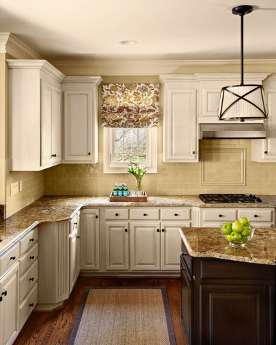 What did we change? As I mentioned above, the existing layout remained the same — as did the appliances. The majority of the cabinets were beautifully painted in a creamy white with a light glaze. The island was painted in a darker wood finish. In the hands of an amateur, I would be nervous about these finishes and their durability … but my cabinet painter is incredible. I don’t trust anyone else!
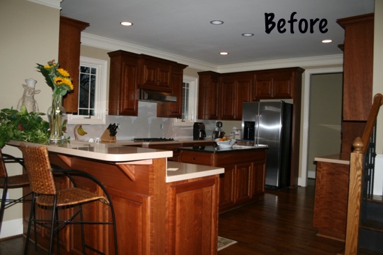
 Let’s go ahead and take a look at the “before” photo. Do you recognize it as the same kitchen?
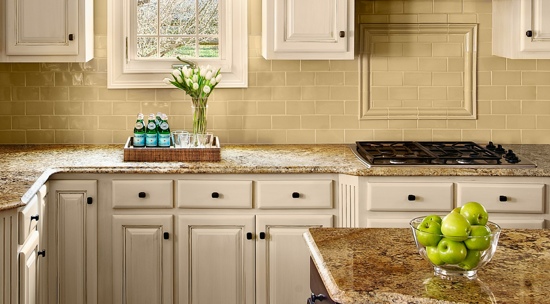
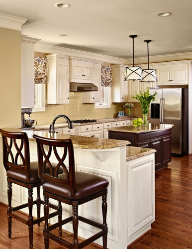
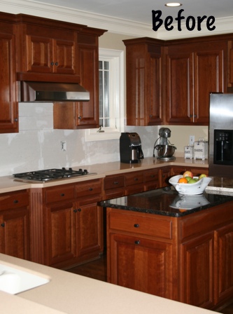 The existing countertops — a solid surface on the perimeter and a black granite on the island — absolutely had to go. Can you see how peachy the perimeter countertops look? Blech. The natural stone backsplash had already been torn out by the time this photo was taken, but trust me on this: It was just more peach. New granite countertops — using the same on the perimeter countertops and the island — and a creamy beige subway tiled backsplash made an incredible difference. If you compare the “before” and “after” photos, you’ll also notice that we added a lip to the island countertop — to give the somewhat undersized island a little more presence and allow room to pull up a backless bar stool.
 The existing kitchen was lit only by recessed cans, but pendant lights over the island defined the space and added “jewelry” to the kitchen. New barstools and Roman shades completed the transformation.
What do you think about the changes?





30 Comments