The best part of High Point Market is getting to see the new introductions from your favorite designers and manufacturers. Thomas O’Brien’s new collection for Hickory Chair was easily the most anticipated introduction of the market … and it lived up to every bit of the hype. The Library Collection, as it is called, is nothing short of spectacular! As you know, I had a sneak peek of a few pieces going through the workroom while I was up at Hickory Chair University … which made it even more special to see everything in its finished form in the Hickory Chair showroom. I’m going to do my best to give you a photographic tour through the showroom so you can have a glimmer of the same experience that I did!
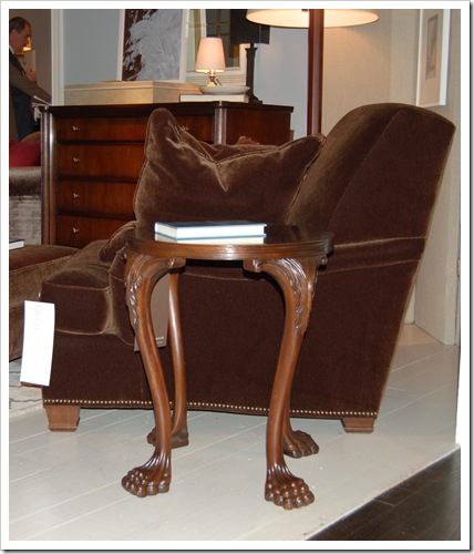
Isn’t this Roberto Chair divine? The velvet upholstery and nailhead trim make the piece especially luxurious … and I love the stepped detail on the foot. There’s also a matching ottoman so you can put your feet up while you read! Paired with the chair is the Jones Footed Table, named after Thomas’ beloved dog. I’m addicted to small occasional tables like this because they are so very useful in a variety of settings. There’s always room for one more table!
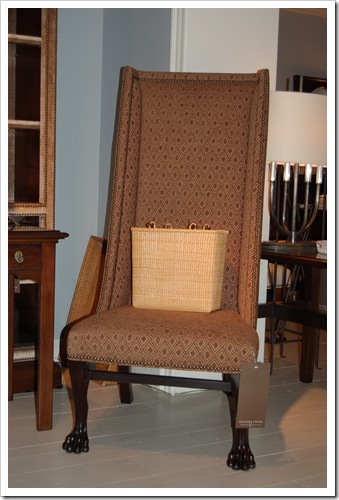
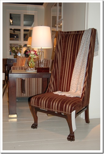
Here’s the Veneto Chair that I spotted going through the workroom. Isn’t it amazing in its finished state? It’s so very elegant.
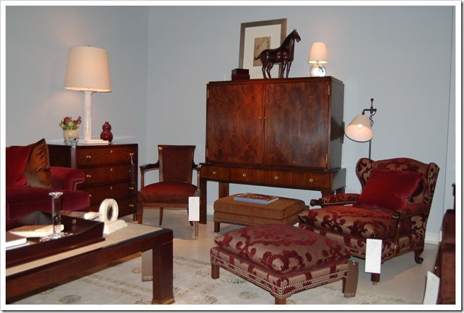
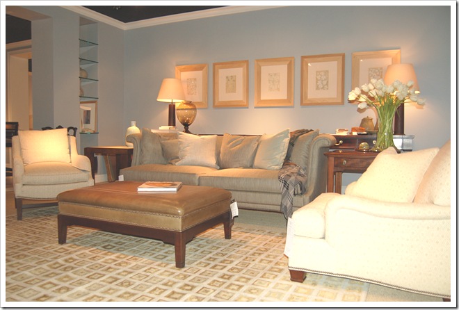
I adore this Warner Club Chair with Knife Edge Cushion and its coordinating Warner Ottoman. The semi-attached cushion just makes it look soooo comfy!
What do you think about the burgundy fabric Thomas used? I was too fascinated with the furniture to pay enough attention to the fabric, but I think it’s flocked. I love the design; it’s a total twist on the classic. I also find the combination of the textures to be really appealing. More interesting, however, is the reappearance of burgundy. Is it just me or have we not seen that used in years? Here, it looks fresh and sophisticated!
Total aside: My sorority (Alpha Phi) colors are silver and bordeaux … so it will be fun for the college girls to be trendy again!
Behind the Warner Club Chair is the Fairley Fretwork Cabinet Deck and Base. The detail on this piece is absolutely exquisite! Thomas mentioned using the deck alone as a stand for a flat screen television. His clients aren’t hiding their televisions these days … and mine aren’t either. For that matter, Thomas said his television is out in the open … and so is mine.
Also notice the Classico Coffee Table with Shagreen Top. I love anything shagreen – again, I think it’s the texture.
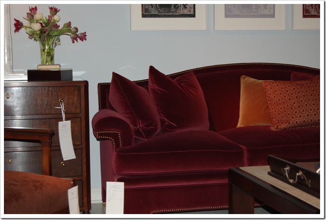
Here’s a closer look at the Atheneum Sofa. I can’t believe I cut off its bottom, but notice how the entire sofa is upholstered, including the legs. The nailhead trim extends not only across the back but also along the bottom. Again, Thomas used burgundy – this time in velvet. Burgundy just feels right for an elegant library … but somehow Thomas has also made it look new. The Darby Bowfront Chest is used on the side of the Atheneum Sofa.
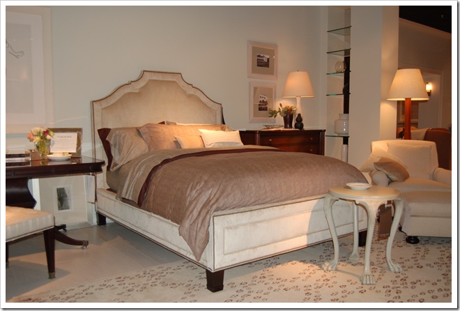
The Fifth Avenue Bed is totally luxe. Given the enormous popularity of Thomas’ Chelsea Bed, I have no doubt that this one will also be a bestseller. Look again at the Jones Footed Table … this time in a cream painted finish. I love how the table looks in this finish! The rug is actually one of Thomas’ new introductions for Safavieh … and we all know how I feel about animal prints.
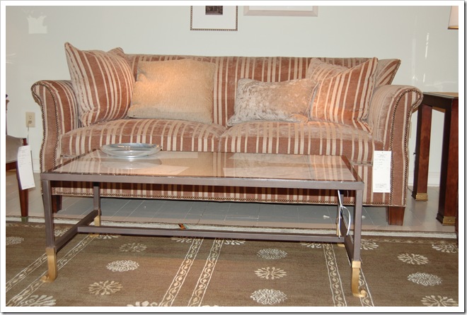
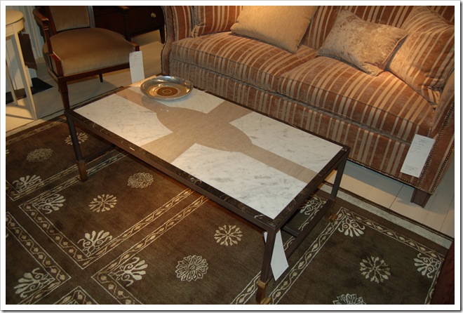
The Calliope Cocktail Table shown here is remarkably versatile. I love the mixed metals on the base …
… and check out the incredible detail on the stone top.
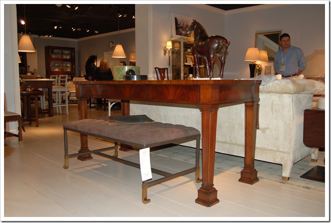
Here, the top is upholstered … and it’s now the Calliope Tufted Cocktail Ottoman. Love, love, love!! The ottoman is tucked under the Sheffield Sideboard (used as a sofa table). The sideboard is, in turn, backed up against the Darcy Library Sofa. I love how these pieces work together so seamlessly … and yet can serve so many other functions.
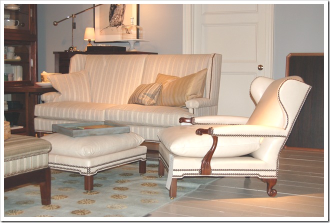
Here’s another look for the Veneto Chair … and I love how the vertical stripes emphasize the height of the chair back.
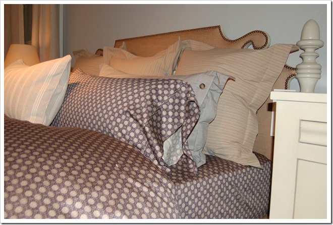
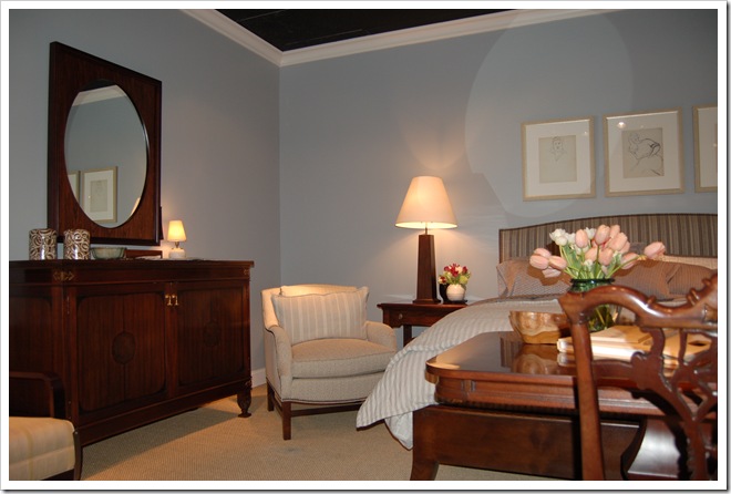
I couldn’t resist including this photo. Isn’t this bed incredibly well-appointed? The bedding only looks expensive … because it’s part of Thomas’ line for Target. Hickory Chair uses as many of its designers’ products as possible – which means you’ll find Thomas’ rugs for Safavieh, his lighting for Visual Comfort, his china, crystal and silverware for Reed & Barton and his linens for Target used with his furniture for Hickory Chair. I love how Hickory Chair does this – partly because it gives the spaces a wonderfully cohesive feel, partly because I get to see some of the best of the other manufacturers, and partly because, with Target, it’s a great high/low mix! I’ve seen the sheets in our local stores, but – if there’s not a Target convenient to you – you can also buy them online here.
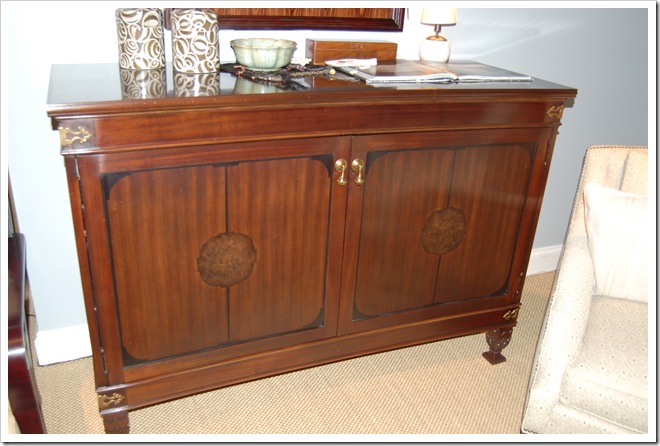
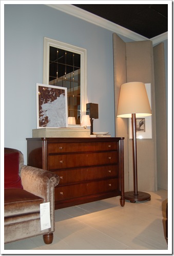
A Cantara Mirror hangs over the Acanthus Cabinet, and I think that’s a Henry Side Table peeking out from behind the upholstered chair. It’s hard to tell from the photograph, but the outer frame of the mirror is darker than the inside piece. It’s really striking! The Acanthus Cabinet is one that will surely be a family heirloom …
… which becomes obvious when you appreciate the remarkable detailing.
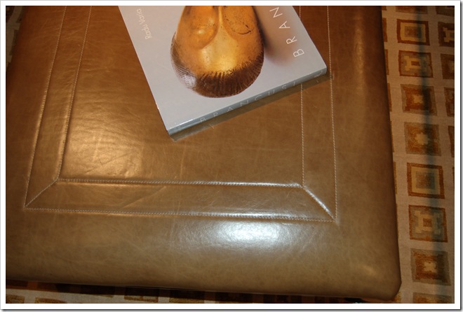
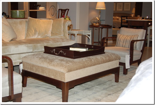
Here’s a better view of the Darcy Library Sofa, but I really wanted to show you the Darcy Library Ottoman.
The framed topstitching is fab-u-lous … and comes standard in a choice of colors. Mad love!
The Warner Club Chair and Ottoman takes on a totally different look in white leather than it did in the earlier photo. Here it almost looks modern! It’s paired with the McKenzie Sofa, which – at 70 inches long – is perfect for a more intimate space.
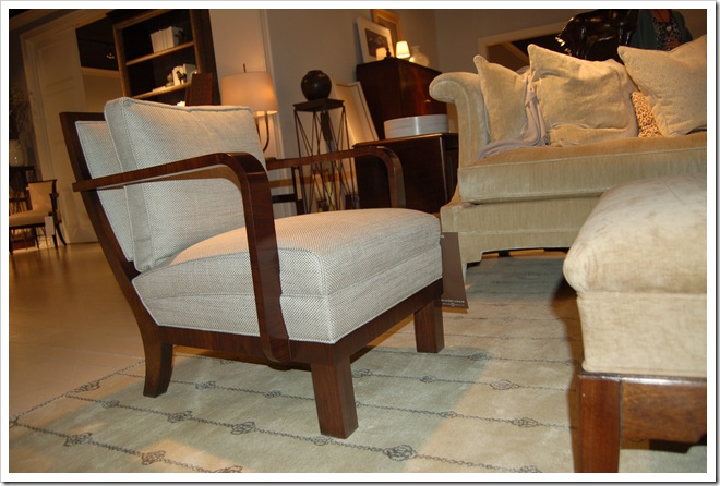
Here’s the Eugene Chair, which I also saw going through the workroom during Hickory Chair University … and I do love it so! I really love its art deco feel and smaller scale.
This photo shows how the chair is rather low slung in comparison but – with its great style – manages to hold its own next to larger pieces.
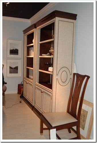
I can’t believe I don’t have more photos of the Marielle Cabinet, because it is absolutely my favorite piece in the collection. Seriously, the cabinet is upholstered and has nailhead trim. Does it get any better than that? I just don’t think so. You can order the cabinet with or without the doors on the bottom, and the shelves inside are fully adjustable. If you look closely, you can see that the shelves themselves are fully upholstered, but the inside of the cabinet is finished wood so that the shelves can be moved up and down.
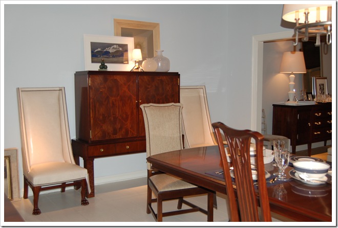
Here’s another shot of the Veneto Chair – taking on an entirely different personality in leather – but I really wanted to show you the Sebastian Upholstered Back Side Chair and the Sebastian Arm Chair. These chairs have so much presence with their high backs (about four feet), but – visually – are not bulky at all. I have my eye on these chairs, as well as the Riverhouse Dining Table, for the Groovy Mom’s renovated house.
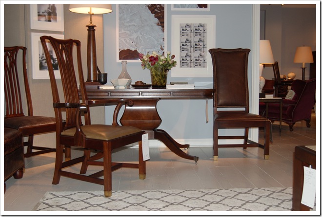
Here’s another peek at the Sebastian Chairs, paired here with the Barbara Writing Table. Thomas named this table after one of his clients, Barbara, for whom he purchased the original of this desk at Sotheby’s for an extraordinary amount of money. You might think that the real Barbara would be upset that her very valuable antique table is now being produced by Hickory Chair … but in fact, she’s delighted. Why? Well, there wasn’t another antique table available. But now that Hickory Chair is making this piece, she can purchase a matching table – of equally high quality – and have a pair!
Last but certainly not least is the Reeded Column Chest. I love the versatility of these classic pieces. They can go from living room to bedroom to hallway to dining room … or anywhere in between.
Whew! Are you still reading or did you just look at the photos? I hope you enjoyed your tour through Thomas O’Brien’s Library Collection. It was amazing to see it in person, and I wanted to share that with you as much as I could. Which piece is your favorite?



7 Comments