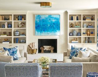
Layers and layers of colors and prints are undoubtedly beatuiful, but I prefer a clean, uncluttered look. Still, I understand that a house needs small doses of color, and that’s why, in my own mostly white house, you will see punctuations of turquoise sprinkled throughout that are a contrast to the structure’s white skeleton.
— Louise Brooks (Traditional Home, October 2012)
In my designs, I often create a neutral envelope and then layer color and pattern in a restrained, thoughtful way. What’s your philosophy?
Visit Traditional Home for photos of Louise Brooks’ gorgeous home on Long Island Sound by Tria Giovan. I would love to work with Tria one day. Her photographs are heaven. And have you seen the new look of Traditional Home’s website? It’s stunning!


1 Comment