Is this like the topic that will never end? I hope you aren’t bored stiff by my oh-so-leisurely spin through the top five trends at High Point Market. I’ve rather enjoyed revisiting my time at market — I find something new every time I flip through my photos!
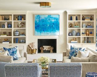
So let’s get down to business, shall we? “Go big or go home” is the Zeller family motto (at least per my hubby) — and that was exactly the mantra I kept repeating to myself at market. Well, my hubby’s usually talking about me flooding the laundry room or something like that … but pshaw. You try dealing with two crying babies, and tell me you don’t occasionally get distracted! Of course, experimenting with scale is nothing new, but — in October — extra large artwork made a statement like it hasn’t in the past.
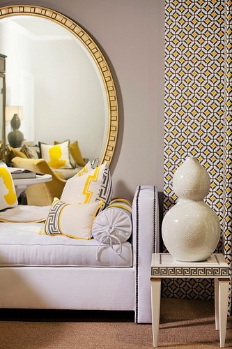 Did you notice the oversized mirrors, which took the place of art, in Tobi Fairley‘s space at Hickory Chair? Talk about drama!! I love, love, love that idea.
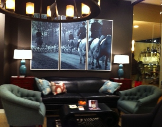 C.R. Laine used a stunning equestrian triptych from Soicher-Marin to set the mood for their sophisticated space in Interhall (the “boutique-y” area of High Point Market). Holly Blalock, C.R. Laine’s creative director, was inspired to create this space in part by Kate Middleton’s style. Don’t you think Holly captured the classic-English-yet-so-modern feel that everyone seems to love about Kate?
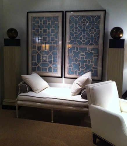 And speaking of Soicher-Marin, they never let me down in the drama department. Suzanne Kasler used their oversized garden plans in her space at Hickory Chair …
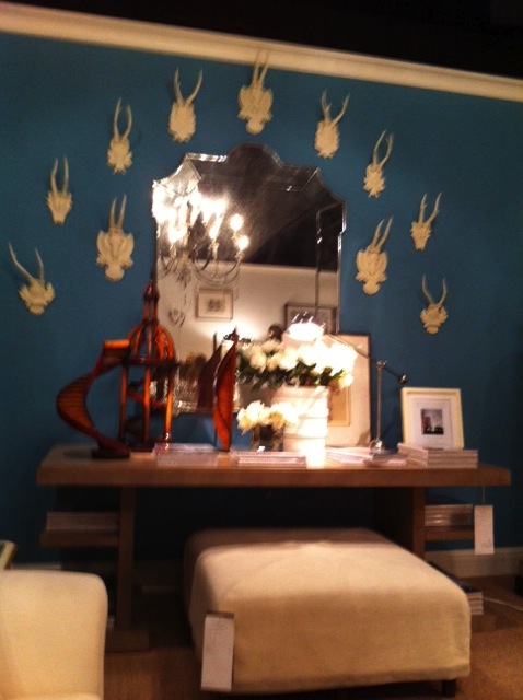 … and made them even more impactful by painting the opposite wall that striking shade of blue.
If those Soicher-Marin pieces don’t work for your scheme, you were sure to find something else in their showroom. Perhaps this …
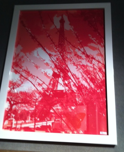
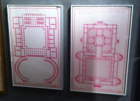
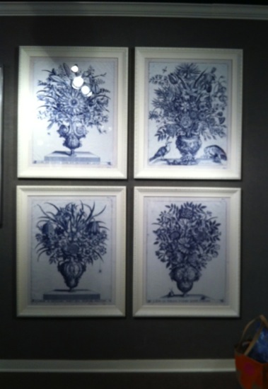 I didn’t crop the crown molding and baseboards out of that photo so that you could see how large those classic blue and white prints really are. Except for Pink Paris, these pieces are all from Lillian August‘s new collection … and you mustn’t forget the large botanicals and pink chinoiserie prints in the “bring in the sunshine” trend post.
I often see artwork that I consider too small … but not nearly as frequently do I see artwork that is too large — so I am pretty excited to see larger pieces hit the market.
Do you use large artwork in your home? If not, will you?
Top photo by Bert VanderVeen. Blurry photos by moi. Sigh!



11 Comments