I’m sure you’ve heard the clichéd saying “you get one chance to make a first impression” — but did you know that it takes up to twelve subsequent encounters to alter that first impression?
 So why would your house be any different? I recently consulted on this newly constructed custom home in Greensboro. The homeowner brought me in for the day to make sure that her new paint colors — let’s get it right the first time — worked with the selections she had already made. It makes much more sense to hire a professional on the front end than to repaint the entire house if the colors aren’t correct!
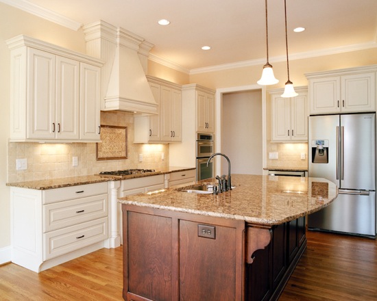 The most important fixed element (that is, not subject to change) in the kitchen was the granite — a very warm stone with orange undertones and lots of movement. I love how Sherwin-Williams Interactive Cream (SW 6113) makes the room just glow!
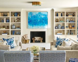
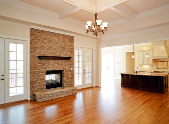 Because the living room opens to the kitchen but is less sunny, we chose to use Biscuit (SW 6112), a slightly lighter cream. The cased opening allowed us to transition the paint color from Interactive Cream to Biscuit without an abrupt start or stop. With the difference in natural light, it looks as though the rooms were painted the same color! Of course, we checked to make sure that Biscuit worked with the stacked stone fireplace. The millwork is painted Sherwin-Williams Dover White (SW 6385), which is a nice warm white.
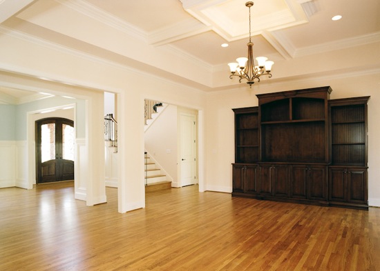 Because the house has high ceilings and beautiful millwork, I specified Biscuit at 50% strength for the ceiling. The contrast between the Biscuit at 50% strength and the Dover White really highlights the detail of the mouldings.
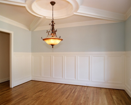 The dining room is off the foyer and nicely separated from the rest of the downstairs by cased openings. I love a pretty blue dining room, and the homeowner does, too … so I specified Sherwin-Williams Tradewind (SW 6218). Doesn’t it look lovely in this sunny space? We kept the Dover White for the millwork and the Biscuit at 50% for the ceiling … which again highlights the mouldings.
Almost everything else had already been chosen by the homeowner, but I did make one additional suggestion. She had originally selected a mosaic for the kitchen backsplash … which was way too busy with the granite. I suggested that the homeowner choose something more monochromatic. Fortunately, the mosaic had not yet been ordered, meaning the homeowner was able to re-select without additional expense.
Now, the only thing left is for the family to move in.
What’s more difficult — building a new house or moving in? I vote moving!
UPDATE: I’ve gotten a number of emails concerning the gorgeous stain color of the kitchen island and living room built-ins. Dixon Custom Cabinetry fabricated these beautiful pieces using a stain color called Whiskey, a rich brown with a burnt umber tone — more orange than red (like cherry). It’s their secret blend, though, so you’ll have to ask them for any additional information. My understanding, however, is that Dixon guards it like the secret formula to Coke! Your best bet? Hire Dixon to build your new cabinetry!
Photos by Bobby Singleton.




10 Comments